![]()
Relates to Topic/Issue
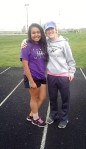
For starters I decided to start my logo design by placing my topic as the attention grabber. I chose to create a shape of a soccer ball for it to demonstrate my passion towards soccer. My idea was to motivate other individuals who faced similar struggles when wanting to join a sport or finding an open door to issues they might have going on that does not allow them to be involved. By doing so, they would want to join the organization just by seeing the name “Dream High” and knowing they will have the support they need to reach their goals regardless of their conditions.
Draft Logo Process
For my draft I started off by using only one layer because I was not quite sure what I wanted to add until I started using the Ellipse Tool. When I started creating the circle, I saw that I could use the polygon tool, for that reason I knew I could create a soccer ball by using the Ellipse tool. I created a few polygons and was not as satisfied with the design because it needed to add stroke for it to look like an actual ball. I felt as it looked empty which is why I decided to add a title for the organization to add more meaning to it. Even after I added a title I wasn’t satisfied because It looked empty and wasn’t catching my attention. I decided to go back to the tutorials to check if I would be inspired to create a design in my logo. Looking at the Tracing Logo Tutorial video inspired me to use the dashed line tool to add attention to the soccer ball as well as trying out different effects to the text. At the end I was happy with my creation and knew I needed one final step, which was adding color by using the gradient tool and looking back to the Tracing Logo Tutorial and following the steps and finishing by expanding the image for the shape and size of the logo to be kept the same when making the image smaller. Overall, I enjoyed creating my draft.
Feedback
I am very thankful for all the comments that I received from some of my classmates and very happy that they enjoyed my logo. I received a few suggestions adding a thicker layer to my text for it to grab more attention and also making a thicker stroke to some of the polygons. Other than those suggestions, my classmates were satisfied with my work. I did make a few changes to my final logo in regards to the feedback I received because I fully agreed with their comments, not extremely changes, but a few that made me satisfied with my work.
Final Logo Process
For my final logo I did not have to make as many changes because I was satisfied with the draft I had created. One of the changes that I made was adding an effect to the text, adding more curve and increasing the percentage grabs more attention to the audience because it delivers the message. Also, another change I decided to add a stroke to some of the polygons because I had not noticed that I did not outline them after sending them to the background, I had to ungroup the image and add a stroke to the polygons. After making these changes, I was satisfied with my work and left it as my Final Logo.

Leave a comment